Dark Patterns in Auto-Renewals: When UX Tricks Users
Have you ever signed up for an online service thinking it’s easy to cancel, only to find later that your account was automatically charged?
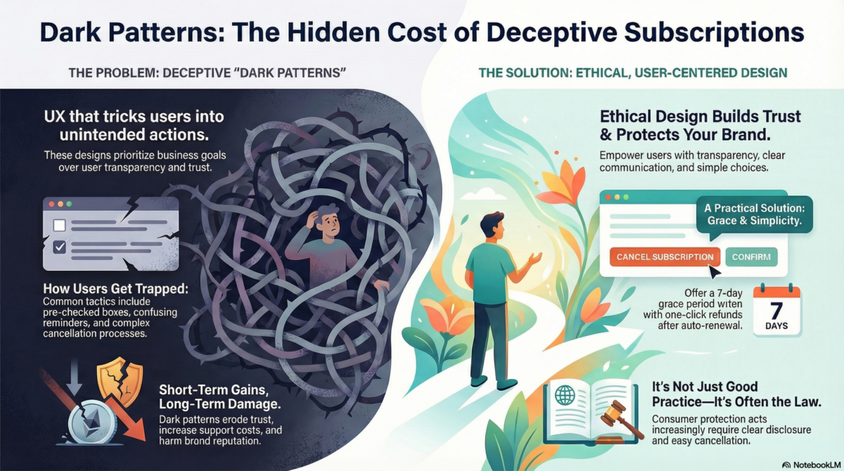
This is a classic Dark Pattern a UX/UI design tactic that nudges users into actions they didn’t intend, often benefiting the business more than the user.
How It Happens
Many websites use reassuring phrases like “Don’t worry, you can cancel anytime” to encourage sign-ups. But in practice:
- Auto-renewal checkboxes are often pre-checked, hidden, or confusing.
- Reminder emails about upcoming charges are vague or look like promotional messages, so users ignore them.
- Cancellation after the first year can be complicated, with limited or no refund options.
Example: A popular online learning platform I tested had auto-renewal pre-checked. The reminder email looked almost identical to other promotional messages, which many users dismissed without noticing.
Why Companies Do This
From a business perspective, these practices are often aimed at:
- Maximizing customer lifetime value
- Improving retention metrics
- Reducing churn
While these are understandable goals, they should not come at the cost of transparency or trust. Dark patterns may even backfire:
- Users feel deceived, leading to negative reviews and complaints.
- Customer support spends hours handling disputes.
- Users may never return, and the platform gains a reputation for being untrustworthy.
In short, forcing users into complex, non-intuitive processes erodes trust, damages reputation, and may reduce long-term revenue, despite short-term gains. Ethical, user-centered design benefits both users and companies in the long run.
The UX Problem
A well-designed subscription experience should:
- Clearly highlight auto-renewal and upcoming charges
- Send noticeable and actionable reminders
- Pause or allow the user to confirm auto-renewal
- Offer a grace period and easy refunds
Practical Solution: A 7-day grace period after auto-renewal, combined with one-click refunds, balances business needs with user trust and prevents friction and resentment.
Regulatory Context (Canada)
Canadian consumer protection laws are increasingly addressing these practices:
- The Competition Act prohibits misleading marketing and unconscionable practices, which can include deceptive auto-renewal designs.
- The Canadian Consumer Protection Act mandates clear disclosure of recurring charges and an easy cancellation process for digital services.
This demonstrates that ethical UX is not just best practice, it’s increasingly a legal requirement.
Counter-Perspective
Some may argue: “Users agreed to the Terms & Conditions.”
True, but burying important information in fine print still violates good UX principles. User-centered design means helping users make informed choices, not tricking them.
Takeaway
Dark Patterns like hidden auto-renewals may increase short-term revenue, but they:
- Erode trust
- Waste company resources
- Damage long-term relationships
Ethical UX requires:
- Transparency
- Actionable communication
- Design that empowers users, not exploits them
Designing for users doesn’t just protect them, it protects your brand, your reputation, and your long-term business success.